About the Practice

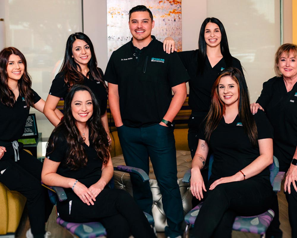
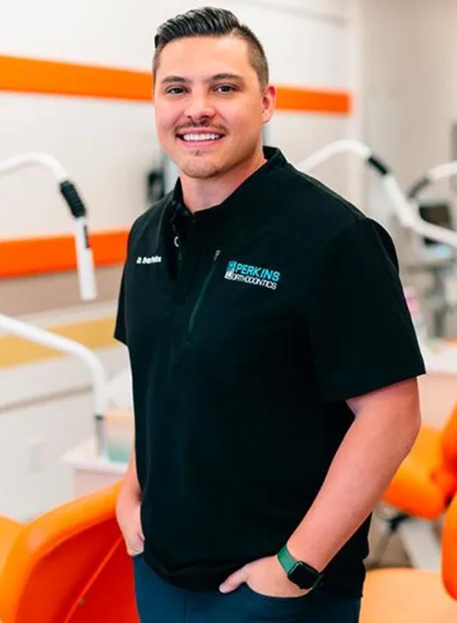
Perkins Orthodontics is dedicated to providing each patient with exceptional care that meets their needs and suits their lifestyle. With this project, they wanted to put their clients first by making their patients’ experience easy and convenient every step along the way.

How it Started

Perkins Orthodontics first came to Houmanity for help when they identified a need to update their website and improve clarity and accessibility for their patients. In addition, they wanted to make the services clear for their clients and ensure researching information about their services was simple.

Creating the Digital Brand Identity

At Houmanity, we treat you as the experts. We know that you value your business, and everything we do is to help you get your business to where you want it to be. We work directly with our clients to maintain brand identity and help bring your vision to life.
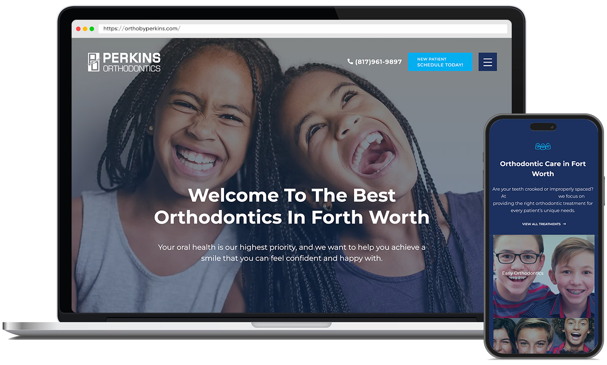
When working on updating the Perkins Orthodontics website, Houmanity worked with Dr. Perkins to understand his desire for a clean, professional website that was easy to navigate. As a result, we kept the brand’s modern blue color and added white space to improve readability, keeping the overall look minimalistic and professional.

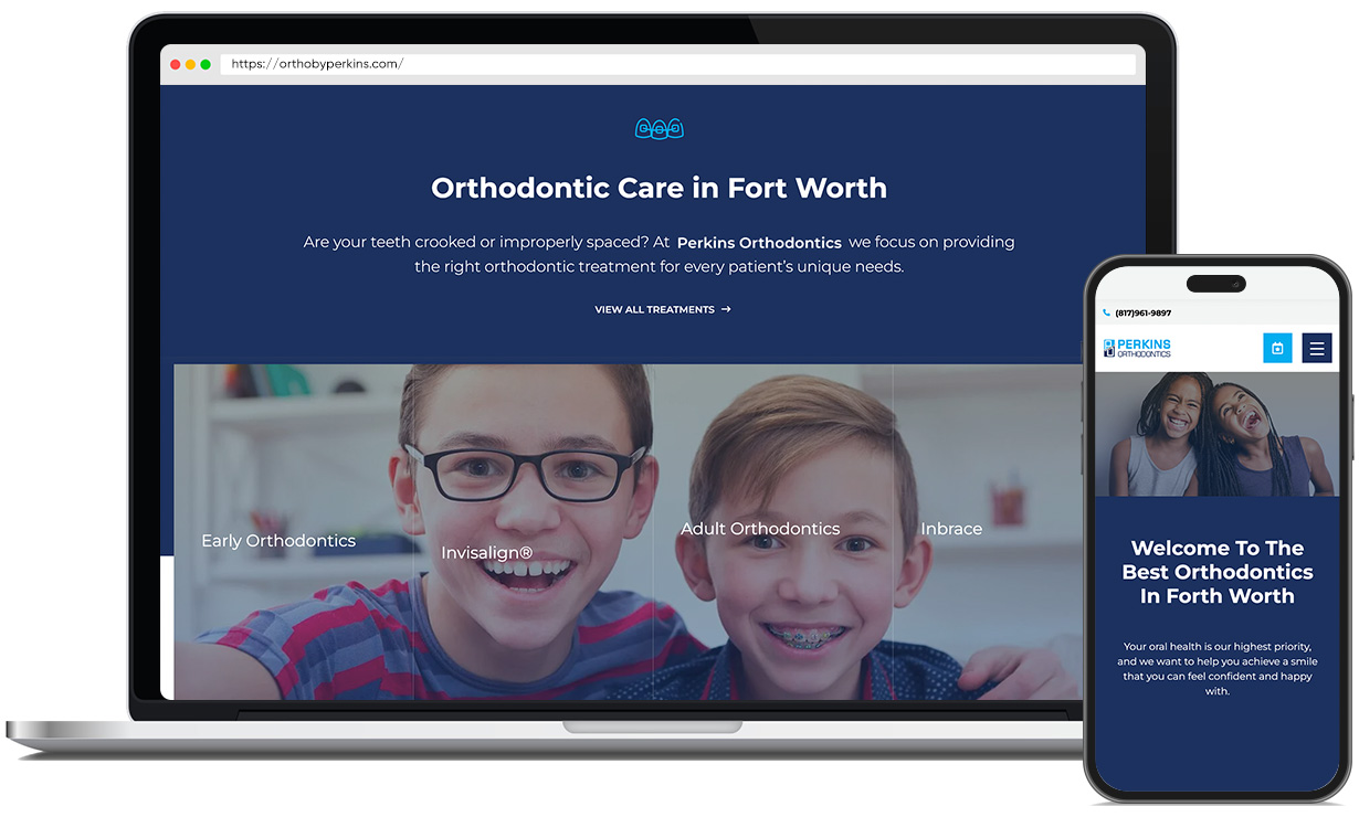
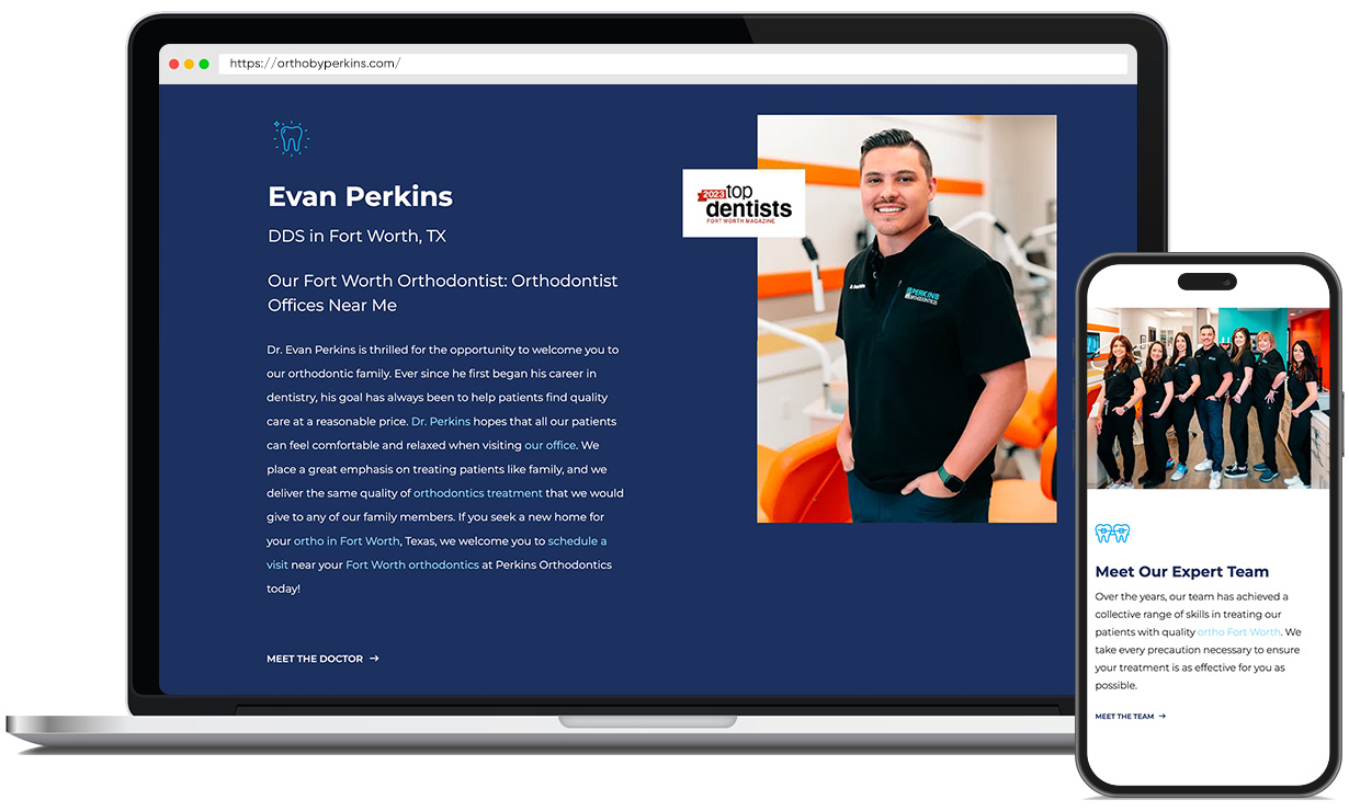
To emphasize Perkins’s mission of providing high-quality care, we made the services they provide clear for viewers to see. Additionally, we emphasized Dr. Perkins’ qualifications as a board-certified orthodontist by placing this information front and center on the website. After visiting the new website, viewers can learn that a board-certified orthodontist, Dr. Perkins ensures that all patients receive high-quality treatment and know that they are valued.

When you work with Houmanity, you can expect to enjoy every step of the process of developing your website. We take care of the details so you can focus on the fun and joy of watching your dream website come to fruition.

The Challenge

Working directly with Perkins Orthodontics, our team identified that the previous website could be improved and information on their services was difficult to find. Therefore, we strived to improve the readability and user experience by re-organizing information and further developing the brand of Perkins Orthodontics. Dr. Perkins is the sole provider of Inbrace in Fort Worth, Texas. It was important that patients in the area can find Dr. Perkins and understand the benefits of Inbrace. We created original content and a new sitemap that prioritized user experience.

Web Design

Scope of Work

Discovery

  • Workshops
  • Research

Strategy

  • Persona Development
  • Information Architecture
  • User Experience

Design

  • Art Direction
  • Web Design
  • Visual Moodboards
  • UI Design
  • Content Creation
  • Print Materials

Development

  • Frontend Development
  • Backend Development
  • CMS Integrations

Marketing

  • Google Ads
  • SEO
  • Print Ads